“Nina thank you…you are the first designer to give us a different look which is what we’ve been asking for.”
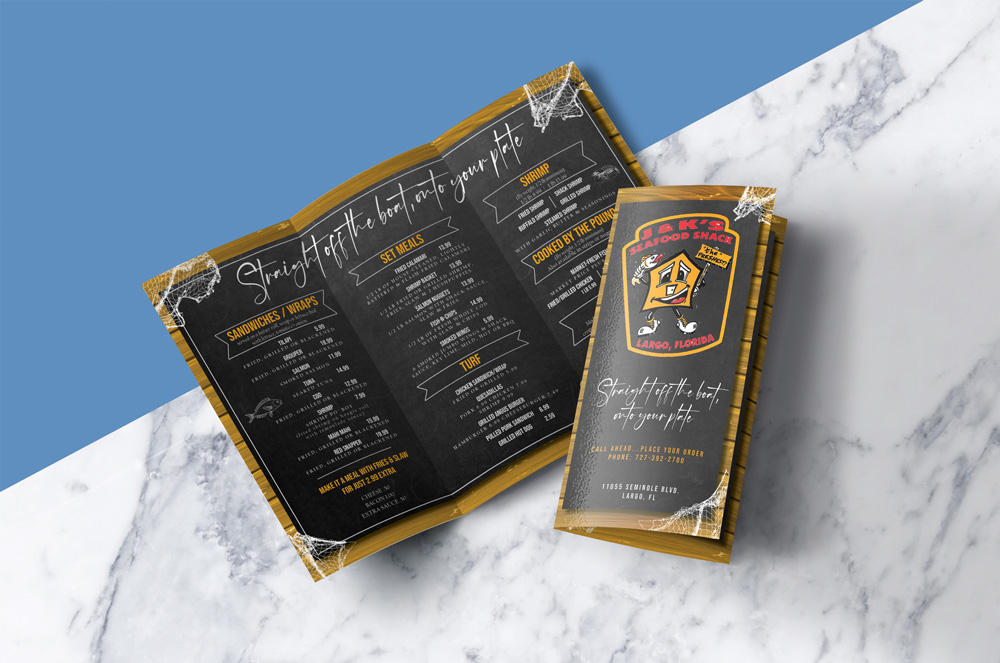
J & K TeamJ&K Fishbar are based in the states and are a self-confessed old-school style seafood shack. As both a fish market and fast casual restaurant, the brief was to design a simple tri-fold logo with their logo and their offering. They wanted to convey the freshest seafood in a no frills environment.
“I love it, thank you so much!”
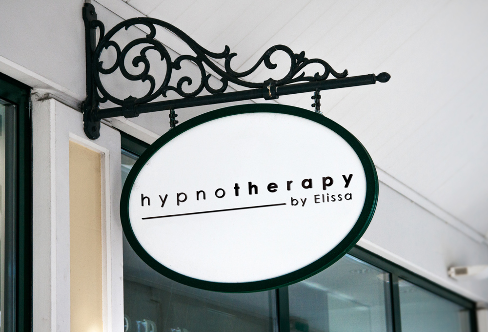
Elissa, OwnerHypnotherapy by Elissa is a business from Hertfordshire that has been going for quite some time, but the owner decided an identity was needed, and that all starts with a logo. Friendly and simple was the brief; something that would show the approachability of the business.
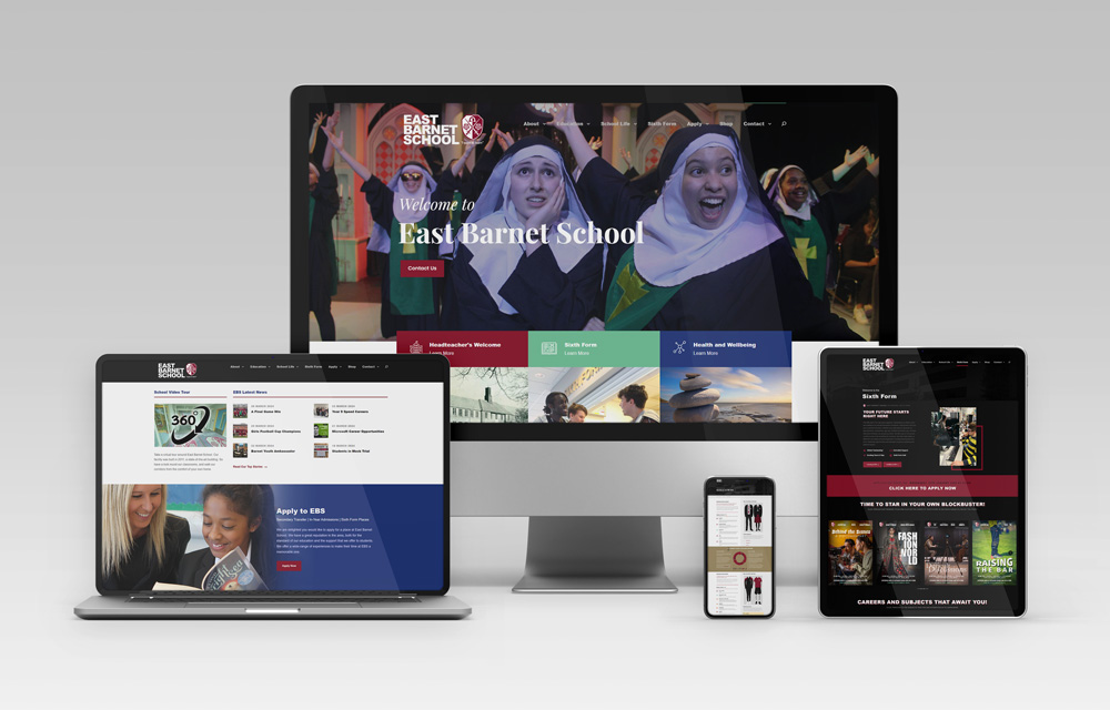
Visitors have drastically increased since the new website launched and there is a low bounce rate as the new navigation structure is embedded.
]]>“That looks great and does the job!”
Martine, OwnerDtD Healthcare is a new branch of an existing business in London, UK that researches the most up-to-date healthcare solutions and helps to distribute and train staff in using the equipment. The brief here was all about clean and simple lines, that made reference to hot and cold lasers, and was a wordmark identity with the possibility for a small logo.
“Great! Really matches my brand!”
Jo, DirectorEnglish Today Recruitment is a company in the UK that helps place teachers and support staff in schools for both short-term and long-term contracts. The brief was to include an element of the UK in the branding and for it to reflect schools in some way in a colourful way.
“Thanks, Nina. Cheers!”
Geoff, ManagerJeck Holdings Ltd, based in Canada were in need of a logo design for their property holding company that held and managed investment real estate. The brief was to create a logo that conveyed reliability, with simple, crisp graphic elements.
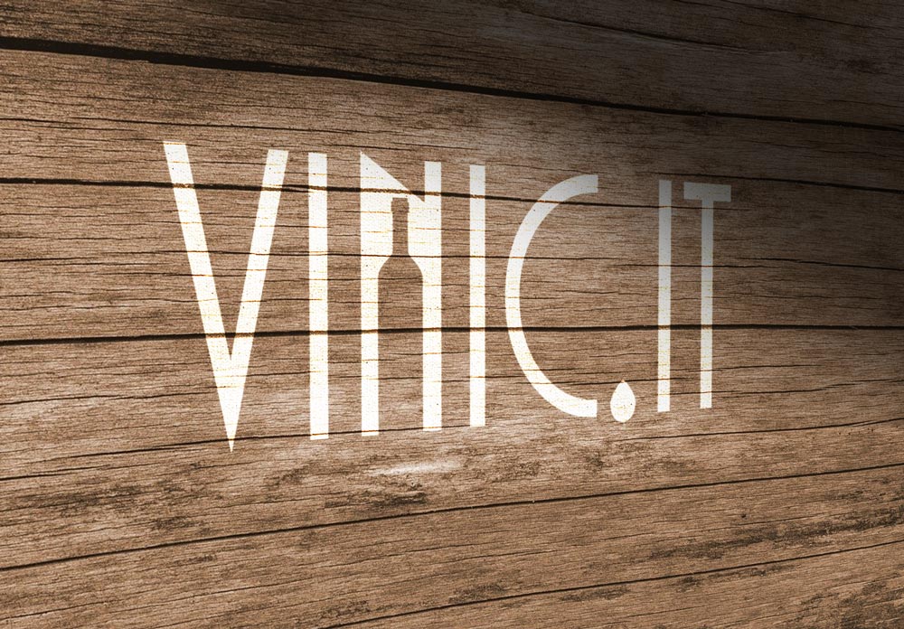
“We like this very much; it is very well designed and very precise. We like the idea of the N and the drop as a dot.”
Vinic.IT TeamVinic.it is an e-commerce start-up focusing on the distribution of Italian wines across Europe, integrating the e-commerce functionalities within the websites of the most talented Italian wineries in order to allow them to simply sell their products to everyone is interested in. The brief was to design a logo that reflected that business.